Should public transport services be increased along roads with proven high vehicle demand in order to most efficiently divert trips away from private vehicles?
Vehicle Traffic and PT Trips
I collected the latest average daily traffic volume from Transport Victoria and found each segment of road (minimum of 40m) that aligned with a bus or tram route (within 35°) using Pandas. Mapping the raw arterial vehicle volume data, the greatest demand along major freeways is primarily visible, but it also highlights continuous vehicle demand corridors along Wellington Rd / North Rd, Springvale Rd, Burwood Hwy, and Warrigal Rd.
.png)
%20(1).png)
Public Transport is very visible in Melbourne across each mode, however one-third of arterial road segments within Melbourne don’t have buses or trams. Excluding freeways, these are the top three segments of road with the highest car traffic but zero public transportation choices:
| Road | Busiest Segment | Suburb | Traffic Volume |
|---|---|---|---|
| Kings Way | Albert Rd - Queens Rd heading south-east | Melbourne | 51468 |
| Queens Rd | Lakeside Drive - Lorne St heading south | Melbourne | 43184 |
| Nepean Hwy | Centre Rd - Hawthorn Rd heading north-west | Brighton East | 37361 |
Kings Way and Queens Rd are an inner-city connection allowing cars heading into the CBD to bypass St Kilda Rd. They intersect very close to Anzac Station and the St Kilda tram corridor. Nepean Hwy is a major 80km/h arterial that runs parallel to the Frankston line to Moorabbin Station. There is potential to create a high-frequency route out of SRL Cheltenham along Nepean Hwy, as the busiest segment in Brighton East is served by the infrequent Route 823 which runs a roughly hourly service with poor span.
While roads may have some public transport choices, only high-quality public transport is useable at scale. Plotting trip counts by arterial shows that tram services provide constant high quantities of daily trips with long spans and high frequencies that few bus routes currently compete with.
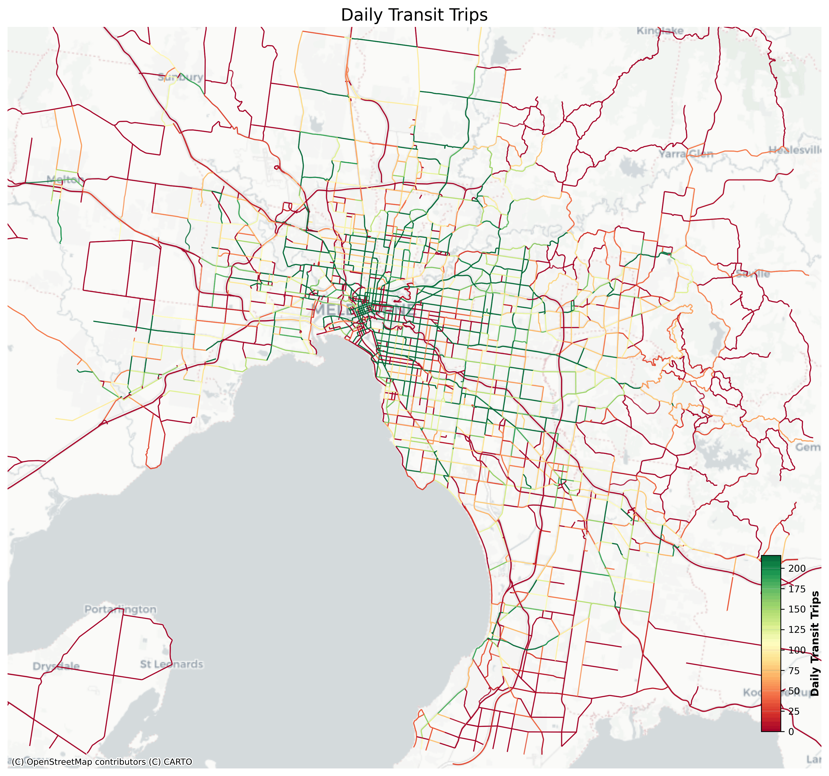
SmartBus Routes 901 and 902 on the previous map fail to provide a dark green colour for their unique segments, while Route 900’s peak service increase and other routes which share the Wellington Rd corridor set itself as a contender for continuous bus lanes. Doncaster’s bus network goes strong with DART routes in all directions. The inner north has strong north-south tram routes; however connecting east-west buses provide limited service. In the west, there are unfortunately very limited high-frequency routes that need to catch up with demand.
Comparing PT and Traffic
All roads can be designed to be inclusive of all user groups; however many aren’t. Here are the five busiest roads that have public transport running along them:
| Road | Busiest Segment | Suburb | Transit Trips | Traffic Volume |
|---|---|---|---|---|
| Kings Way | Sturt St - York St heading north-west | South Melbourne | 510 | 50165 |
| Eastern Freeway | Hoddle St - Alexandra Pde heading west | Abbotsford | 388 | 45670 |
| Nepean Hwy | Dendy St - Patterson Rd heading south-east | Bentleigh | 13 | 42290 |
| Hoddle St | Johnston St - Alexandra Pde heading north | Collingwood | 943 | 40823 |
| Old Princes Highway | Offramp to Princes Hwy heading north | Beaconsfield | 115 | 39552 |
While the very busy Kings Way is partly unserved by PT, it’s also finds itself at the top of this table as it provides dedicated tram lanes for the Route 58, allowing an uninterrupted interpeak frequency of 10 minutes. The Eastern Fwy and Hoddle St should both receive all-day bus lanes for their duration which the 10+ routes clearly demand. Nepean Hwy shows up again at #3 with the infrequent Route 823, and Old Princes Hwy in Beaconsfield has three bus routes (837, 926, 928) which provide a poor service.
Creating a geospatial visualization of the ratio between the previously two daily calculated values, total vehicle volume and total number of public transit trips, we get the following map. A high cars-per-transit-trip ratio on a given corridor doesn’t prove residents want to drive; rather if they wanted to take PT instead, the service on offer couldn’t realistically absorb that demand.
.png)
While the service quality of particularly trams in the inner north and east provides a real incentive to rely on public transport, middle- and outer-suburbs force residents to find alternative travel options with inaccessible bus frequencies. While there are stretches of road that provide a decent quality of service compared to car demand, the current quantity of resources in Melbourne’s bus network means that it cannot compete with private vehicles.
On a positive note, I calculated the top 5 highest transit trips per car ratio segments of roads, and as expected multiple-route tram corridors serving the CBD dominate this list. This is a useful metric to see roads that should potentially separate buses and trams into their own right-of-way.
| Rank | Road | Busiest Segment | Suburb | Vehicles Per PT Trip |
|---|---|---|---|---|
| 1 | Swanston St | Latrobe St - Franklin St heading north | Melbourne | 1.01:1 |
| 2 | Wellington Pde | Flinders St - Jolimont Rd heading east | Melbourne | 1.56:1 |
| 3 | Elizabeth St | Collins St - Flinders St heading south | Melbourne | 1.86:1 |
| 4 | Bourke St | King St - Spencer St heading west | Melbourne | 2.20:1 |
| 5 | Collins St | Spencer St - King St heading east | Melbourne | 2.32:1 |
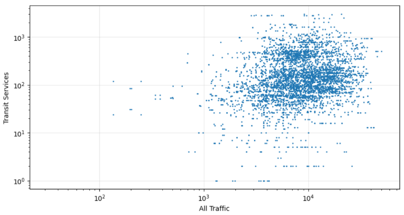
When completing a linear regression between traffic demand and the allocation of PT services, removing roads where buses and trams cannot stop frequently including freeways, we get a poor R² value of 0.11. As visible in the below chart, there’s not a clear relationship between demand for cars and public transport options.
Car Dependency
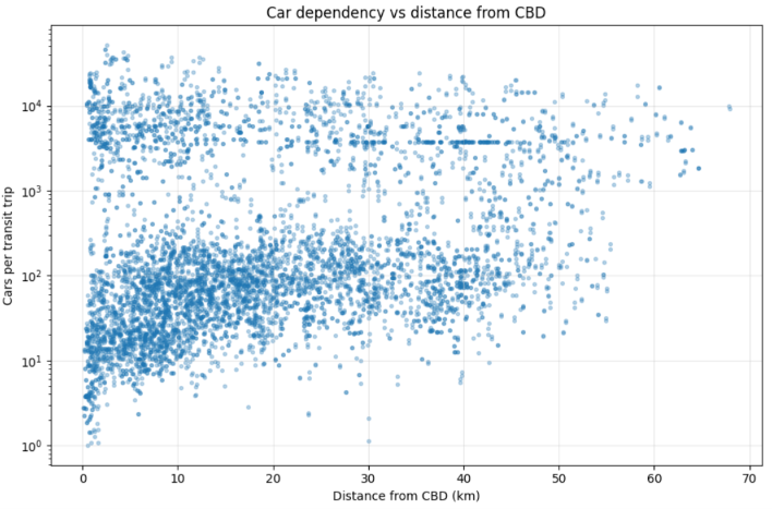
We already know the quantity of public transit service per car trip dramatically decreases away from the CBD, and it continues to contribute to Transport Inequality within Melbourne. Within 5km of the CBD, the median vehicles per PT trip is 43.2, while between 10 and 15km of the CBD, it’s over double. This trend can be seen below:
Service Per Suburb
Local governments find themselves continuing to advocate for better public transport services within their municipalities because of historical transit inequality. These suburbs have the best and worst PT to traffic ratios along arterials (minimum 10 arterial road segments and at least one PT route to qualify):
| Rank | Suburb | Routes | Vehicles Per PT Trip |
|---|---|---|---|
| 1 | Melbourne | Bus x29 Tram x22 | 9.5 |
| 2 | Albert Park | 12, 606 | 12.9 |
| 3 | Middle Park | 1, 12, 236, 606 | 13.2 |
| … | |||
| 239 | Melbourne Airport | 478, 479, 901 | 561.9 |
| 240 | Moorooduc | 782, 783, 887 | 573.6 |
| 241 | Keilor | 421, 476, 483 | 599.4 |
Melbourne unsurprisingly tops the list with 51 bus and tram routes either terminating or running through the CBD. Inner-city Albert Park and Middle Park have a couple of high-frequent routes and minimal car demand, serving as ideal places to live without a car. Meanwhile, Moorooduc has three low-quality bus routes (782, 783, 887) with hourly frequencies or worse with very poor span which do not come close to meeting car demand. Keilor has twice as many services (421, 476, 483) but also twice as much traffic volume which places it similarly. Melbourne Airport has limited connections for people choosing to fly; while the Route 901 is somewhat frequent there’s not much service outside of it, and provides potential for future heavy-rail with most people driving to the destination.
Service Per Route
I found out which routes run on the busiest stretches of arterial road. Variable traffic times can impact how late a bus is, so I combined this with recently published data from the Victorian Auditor-General’s Office on on-time performance (which reported a mean of 72%).
| Route | Traffic Volume per km | On-Time Performance |
|---|---|---|
| 232 Altona North - City | 4166 | 59.23% |
| 511 Craigieburn - Mandalay | 1317 | 45.74% |
| 483 Sunbury - Moonee Ponds | 1071 | 71.31% |
Each of these routes runs along very busy freeways with limited stopping patterns along them. There’s potential to see if there’s a relationship between traffic along a route and on-time performance; however the traffic volume dataset only provides data across arterials while many routes run along local roads too.
Simplifying our Network
It’s natural for activity centres to have multiple routes running into their bus interchange. However a simple memorable network is a useable network, which means that roads should generally strive for fewer routes if it results in higher frequencies.
.png)
Routes 600, 922, and 923 along the coast from Sandringham to St Kilda all run along a similar path at poor frequencies, where a combined bus would provide a greater quality of service to it’s coverage areas.
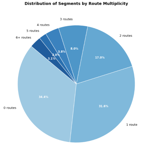
Aggregating the number of arterial road segments with each number of routes running along it at some point, roads with one route sit at 31.6% which is slightly less frequent than 0 routes at 34.4%. Road segments with lots of routes are likely to be serving bus interchanges, for example Box Hill has 16 routes that at some point run along the segment of Station St outside Box Hill Central.
Conclusion
There’s huge potential to simplify our network along arterials and to distribute resources to maximize patronage. A bus reform plan for Melbourne will deliver the greatest benefits if it increases arterial coverage as well as service quality; otherwise it will never meet demand from private vehicles.